Your screen blinks, then flickers. Suddenly, text turns into a jagged mess of misplaced characters. You just hit a bug, but what you see looks like art. This is Error Sans, a typographic phenomenon born from technical failure that captured the online world. While it started as a frustrating browser glitch, it grew into a style, a meme, and a visual touchstone for the early web. We will look at the history of this anomaly, how it became a cultural icon, and why its unpolished aesthetic still feels fresh today.
The Accidental Birth of Error Sans
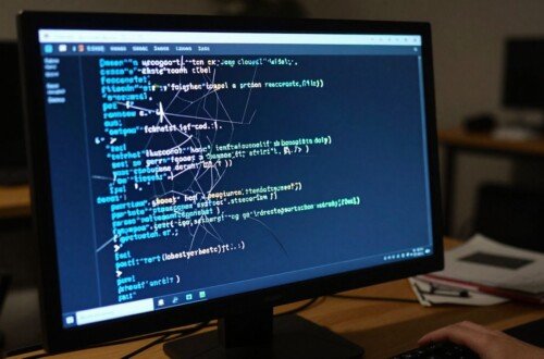
In the early days of the web, browsers did not always render pages the right way. Coding was less standard, and internet speeds were slow. When a browser failed to load the correct font file, it fell back to a default system font. Sometimes, that fallback caused a clash in the code. This clash produced the messy, broken characters we now know as Error Sans.
Technical Glitches and the 404 Page
The most common place to see this was on a “404 Not Found” page. When you tried to visit a dead link, your browser would panic. It tried to display an error message, but if the web page’s code was broken, it couldn’t display the intended font. Instead, you got whatever jagged, unstyled text your system had ready. This looked like a jumble of letters and strange symbols. It was not a font you could download; it was a symptom of a system failing to do its job.
Early Internet Pioneers and First Sightings
Before social media, people talked on forums, message boards, and in chat rooms. Users began to share screenshots of these broken pages. They laughed at the messy code and compared their own browser errors. Someone on a forum would post a link to a weirdly broken page, and others would click it just to see the chaos. This was the start of Error Sans as a collective memory. It was one of the first times people bonded over a shared technical failure.
Error Sans as a Meme and Cultural Icon
People did not just see these errors; they started to share them. They realized that the broken, messy text had a strange kind of personality. It fit the chaotic, wild-west vibe of the early internet.
The Rise of the Meme
The spread of Error Sans was rapid. Because it was so easy to take a screenshot, these glitches moved across the web quickly. The font became a shorthand for “the internet is broken.” Users started using the aesthetic for ironic commentary. If someone wanted to show that a website was poorly made, they would add an Error Sans effect to their own memes. It was a visual way to say that the digital experience was not as perfect as brands wanted us to think.
The Aesthetic Appeal
Why does this look resonate? Error Sans feels raw and honest. At a time when everyone wanted their website to look polished and corporate, Error Sans was a rebellion. It was a digital “middle finger” to perfection. The characters were often overlapping, jagged, or strangely spaced. This jarring look stood out immediately. It felt human because it was a mistake, and it felt authentic because it wasn’t trying to sell you anything.
Practical Applications for Error Sans
What was once a bug turned into a design choice. Today, this style has moved far beyond simple browser errors.
Early Web Design and User Experience
Designers began to understand that visual “error states” could communicate information quickly. Even if they weren’t using actual glitches, they used the idea of Error Sans to show where a user went wrong. If a form wasn’t filled out correctly, a designer might use a bold, red, slightly off-kilter font to highlight the mistake. This taught users that when things look slightly “off” or “broken,” they need to pay attention.
Error Sans in Modern Digital Art
Today, artists use the Error Sans look on purpose. They want that retro, rebellious feel in their work. You see this in album covers, clothing brands, and music videos. Designers use tools to mimic the look of a failing font because it adds a layer of nostalgia and intensity. They are taking the “mistake” and using it as a deliberate stylistic tool. The goal is no longer to hide the error but to make it the star of the show.
The Psychology of Error and Why We Notice
Why do we stop scrolling when we see this font? It comes down to how our brains process patterns.
Cognitive Salience and Pattern Recognition
Our brains are wired to notice anomalies. We are trained to scan for normal, readable text. When a pattern breaks—like when letters are out of place or fonts are misaligned—our brains pay attention immediately. This is called cognitive salience. The Error Sans look forces the viewer to pause and decode the message, which makes them remember it longer than standard text.
Nostalgia and the Early Internet
For many, Error Sans is a direct line to their childhood or their first time online. It brings back memories of slow dial-up modems, noisy connections, and a time when the internet felt like a vast, unexplored frontier. It reminds us of an era when the web was more personal and less managed. The aesthetic is a visual trigger for that simpler, more chaotic time.
The Future of Glitch Aesthetics
Glitch art is here to stay, and the influence of Error Sans is growing.
Evolution of Glitch Art
Designers are getting better at making digital art look broken on purpose. They use software to create intentional noise, pixel sorting, and font displacement. What used to be a sign of a bad connection is now a respected artistic style. The trend is moving toward finding beauty in digital decay.
Actionable Tips for Designers
If you want to use this look in your own work, do it with purpose:
- Use it for impact: Only use the “error” look for headers or small parts of the design. Using it everywhere makes text hard to read.
- Balance with clean design: Pair your glitchy elements with very clean, readable fonts. This contrast makes the glitch stand out even more.
- Focus on the experience: Don’t let your design get in the way of your message. If a user cannot read your content, the design has failed.
Conclusion
Error Sans is proof that mistakes hold value. It grew from a simple browser bug into a major part of internet culture. Its story shows that imperfections can create something memorable. As digital tools get better, our love for the “broken” look reminds us of the human element in technology. Sometimes, the most interesting things are born from the beautiful chaos of an error.